My Johnny-come-lately exploration of 2e Planescape has gone gangbusters this week. Thanks to hot tips from you fine, but enabling folks, little brown packages from the mail order gods have been rolling in each day.
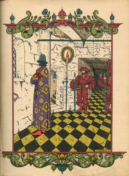
Contact has left me appreciating much of that old line with only a few tugs of dislike (nothing about that today I am in “jaunty cap” mood). One of the things that really caught me is the conscious attempt to put together a real, unified aesthetic to the products—a shocker for me really since the vast majority of D&D art became so exponentially awful and commercial year after year following the early 80s.
My interest piqued, I went out looking for why TSR had put out such a markedly different feeling and looking line at the time. Fortunately White Wolf magazine (a painfully pretentious and vapid publication that I feel dirty for having bought legally) had some interesting skinny on its development in issue 43.
Of particular interest was an article by the designer himself, Dave “Zeb” Cook, called “Mutating the Planes”. In the piece he talks about the inspiration that went into the month of figuring out what he wanted to do with the new:
“I put on my headphones and cued up Pere Ubu, Philip Glass and Alexander Nevsky. For inspiration, I read books: The Dictionary of the Khazars, Einstein’s Dreams and The Narrow Road to the Deep North. For fun, there was always...Naked Lunch to Wolf Devil Woman [on] the VCR. For some reason, all this started affecting my brain.”
How could that go wrong? Reading that I can't help but think about all my peers (and really myself too) lists of strange disparate influences in Zak's GM questionnaire meme. A right-brained approach to worldbuilding that I can really appreciate.
Now back to the actual look Cook envisioned:
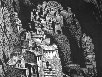
“I could think and write about these things, but the setting needed a look. I already had some images in mind--the gloomy prisons of Piranesi’s Le Carceri etchings, Brian Froud’s illustrations and surrealist art. Foolishly, people believed in me, and Dana Knutson was assigned to draw anything I wanted. I babbled, and he drew--buildings, streets, characters and landscapes. Before any of us knew it, he drew the Lady of Pain.”
Aha, that's what makes it click.
Giovanni Battista Piranesi's 18th-century flights of fantasy (and note how Carceri becomes a prison plane in the setting) has been a longtime favorite from his multilevel crampedness of the prison sketches to the gloomy ruins of Rome to the grand, weird cityscapes. Look at these fine examples and you can see the inspiration points for the work above.
Brian Froud provoked the same reaction, the “Dark Crystal dude”. Just take a gander at some of the concept art for that dark muppetish fantasy flick.
Great stuff.
I like the idea of thinking hard about all your points of internal visualization and pulling them together into a more coherent whole. It beats the pants off thinking about the art as a secondary thing, at best a pretty bow-tied package to wrap up the real meat of the prose.
It seems remarkable to me given the "published setting as schlock factory” that was the bread and butter of 2e-era TSR—a departure I have only really encountered again (successfully at least) in the DIY sections of our hobby in the last few years. Bully for that.